Team: One-person project
My role: UI designer
Context: Final project for the Awari's UI Design course
Problem: Think and create an interface for the Trackfy app, an application that allows the user to keeps track of all their orders in one place.
Tools and skills: Figma, Wireframe, Flowchart, Style Guide, Design System, Prototypes
Timeframe: 1 month
When: 2021
Summary
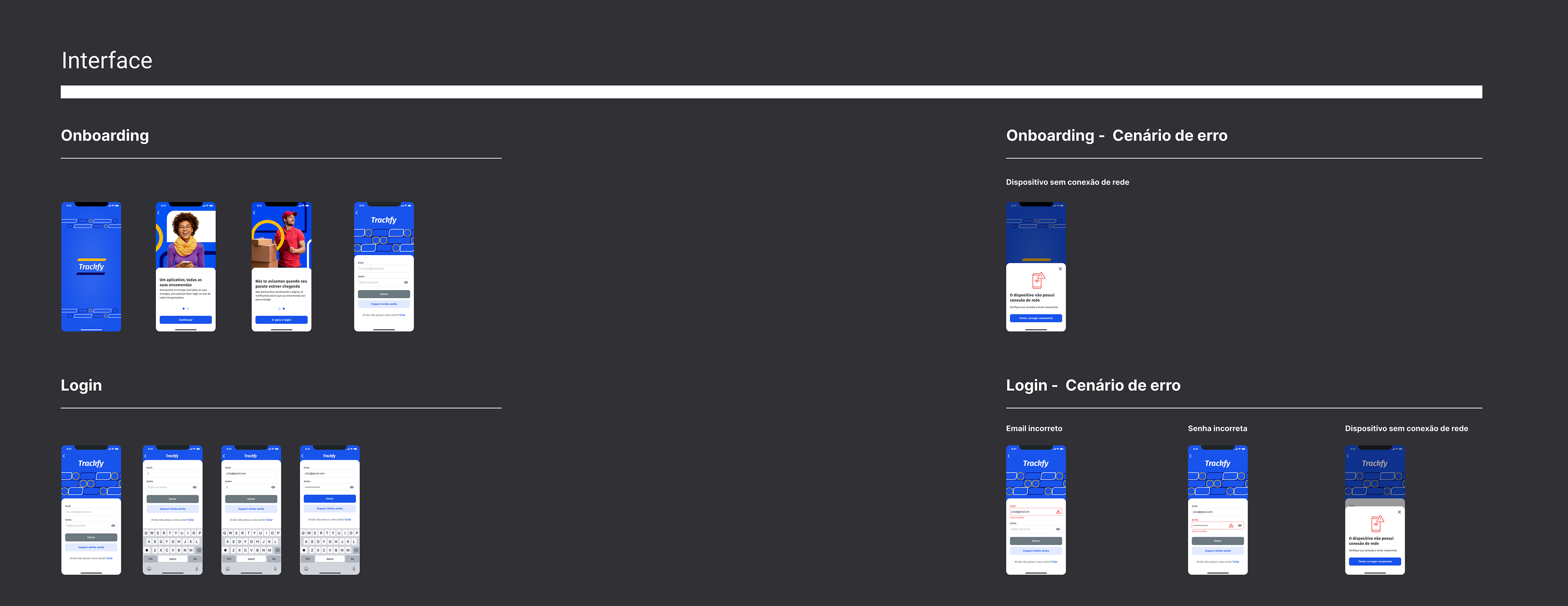
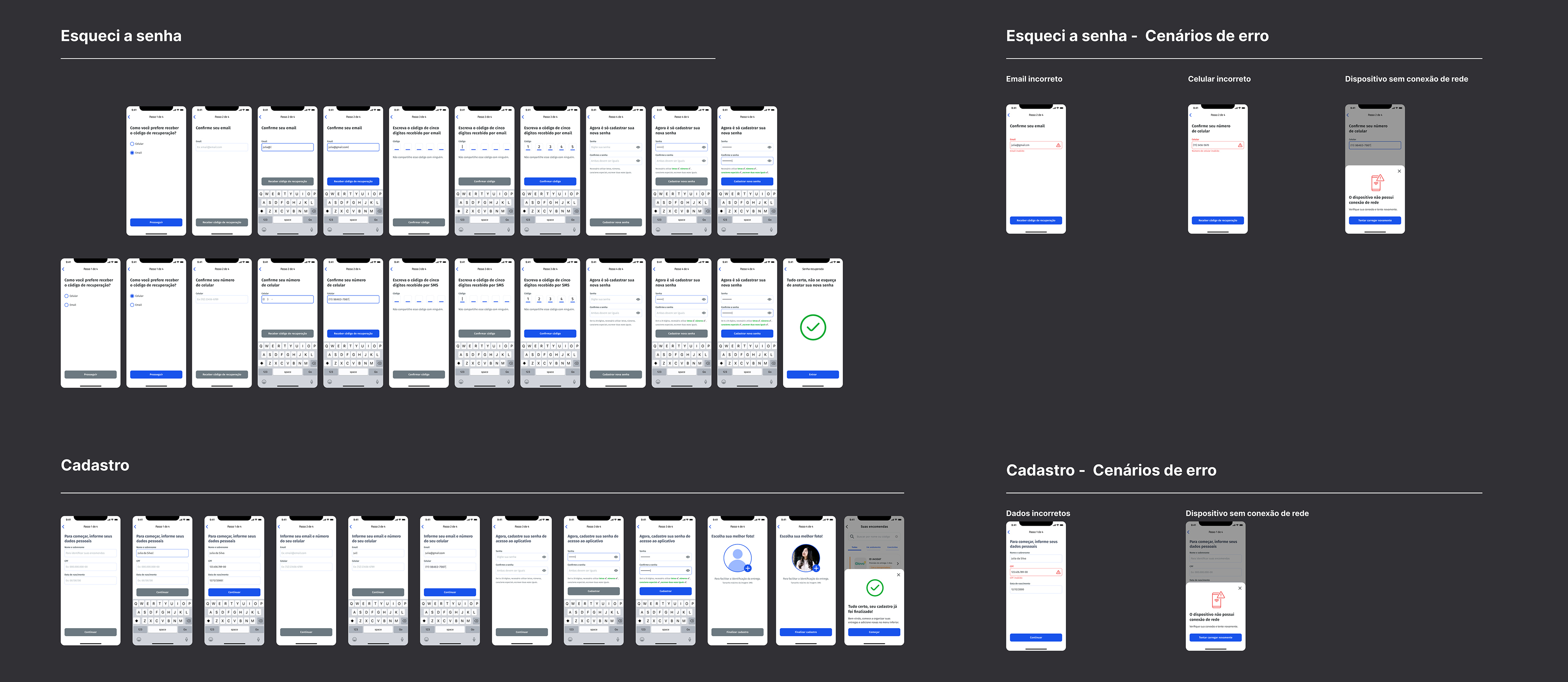
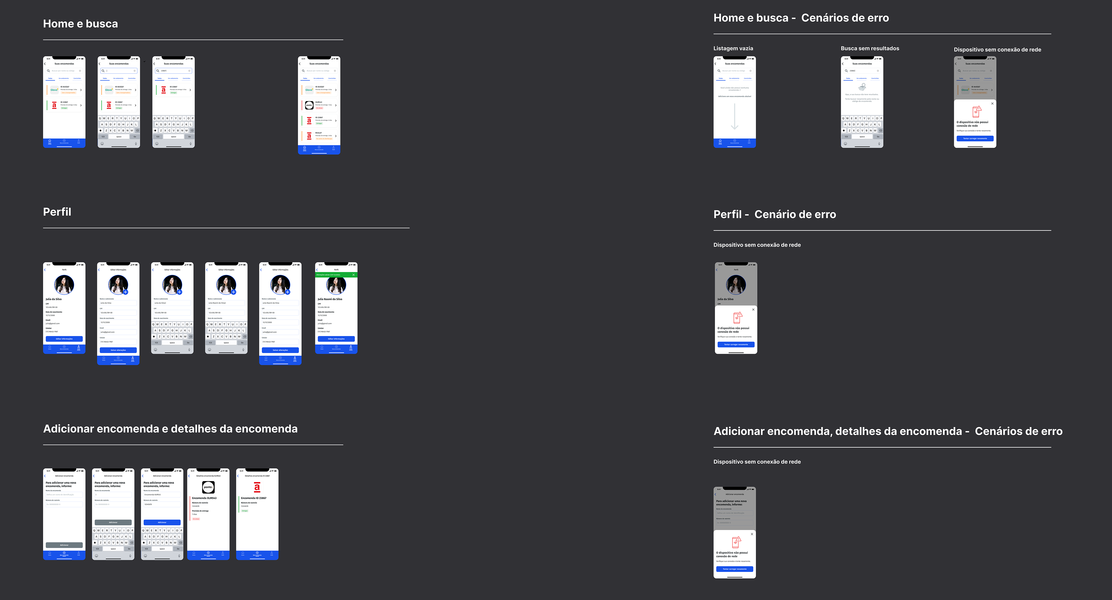
Awari's course had many exercises, and the proposal for the final exercise was to deliver the UI of the Trackfy application, including the main screens, a prototype and a style guide with the main elements of the brand and app. The project proposal contained the app description, its objectives and documentation of the main flows.
Wireframe and flowchart
I decided to start with the flowchart, it helped me organize and map all the decision points and errors. This step was important to have a better understanding and a macro view of the app. Next, I started creating wireframes to get a little bit more into the details.
Style guide
For this part of the exercise, the proposal was to create a very simple style guide. I focused on creating a brand that communicated the idea of movement but also a certain stability, reliability, since we are talking about deliveries.
I chose to use shades of blue, purple and yellow for the visual identity, with blue being the main color. For the typography, I used Fira Sans, a font that I find attractive due to its slightly rounded serifs, besides being also very legible and good for the digital medium, since it has many weights and variations. The brand has several rounded elements so I decided to included rounded corners in the text fields, tags and buttons.
The next step was to evolve the wireframes to high fidelity designs. Now, looking at the final result, despite feeling proud I can't help but make some comments about these final screens and what I would change.
At the time, I drew the flows and then erased the arrows when submitting the work. Today, I would keep the arrows, as I know they help guide and understand the behaviors of what takes one screen/state/interaction to the next.
I also think I could have described all the steps and behaviors better.
I'm not sure if the screen size recommended by the teacher was the best choice. I would have chosen a smaller frame, considering that it's a good practice to start the project with a smaller screen, this practice helps to minimize spacing and usability problems.
Unfortunately, I was unable to add the Figma link here in my portfolio.
Lastly, I made a prototype of the app to materialize the project and specify the interactions in more detail. Making a prototype always adds a lot to the final result, affording a better visualization of the proposal and value, helping in meetings if the project needs to be discussed with other teams, making us notice details that could otherwise go unnoticed and also displaying animations and interactions.
Unfortunately, I was unable to add the prototype link in here but you can watch it in the following video.
Conclusão
I decided to take this course at a moment in my career when I realized I was focusing my studies on research, experience, journey, discovery, data, but I was not giving enough importance on studying how to actually materialize the screens, journeys and interactions. Perhaps because I already had experience working with visual design, I ended up focusing less on interface when learning about digital products. I found in this course really deep content, both in practice and theory, which helped me a lot as a professional.
I decided to take this course at a moment in my career when I realized I was focusing my studies on research, experience, journey, discovery, data, but I was not giving enough importance on studying how to actually materialize the screens, journeys and interactions. Perhaps because I already had experience working with visual design, I ended up focusing less on interface when learning about digital products. I found in this course really deep content, both in practice and theory, which helped me a lot as a professional.
In addition to this project, we did accessibility exercises, responsive projects that work on both desktop and mobile, learned about design good practices, gestalt, usability, screen types, motion, among many others relevant topics. I really liked the course and the result of the final project, although today I would certainly do many different things, considering that I have two more years of experience in the area. Thank you so much for following this journey and see you soon!